2016 Valentine - Love Spiral
The design process this year was inverted from my usual method of refining drawing versions toward lengthy refinement process. I had had a vision for the piece quite clear in my mind, but recognized an unusually hard time refining my inspiration onto paper.
In attempting first sketches of my mental assembly, the vision I had for the piece would be mysteriously, suddenly and frustratingly vacant from my mind each time I tried to draw it out.
In discussing this difficulty with friends, I was inspired to try a new approach in realizing the vision I had in mind using Photoshop (Creative Cloud 2015).
My preliminary design was developed by using an additional black layer of a new document on a digital canvas of appropriate dimensions, which represents the positive space of the block.
I then used the eraser tool with a stipple flat brush controlled by a mouse.
In the image below I'm also experimenting with the vectorizing tool, which I ended up not utilizing.
Later, i used my digital work to base the sketching of the block by hand.
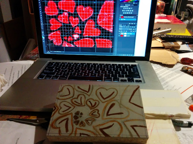
Using a gridview and guides pulled from the rulers in Photoshop, I was able to map my digital sketch.
I translated the preliminary sketch onto the linoleum block using an old-school graph method using pencil. I include a .125 inch border to help keep in mind the borders of the piece as I'm carving, which is an important part in aligning the block with the page.

A key to the piece is the stroke of the carving, so I set intentions for each heart in permanent marker to help encourage the illusion of depth and form of the hearts.
Close-up of the block before carving.
Ready to carve!
I have multiple handles with different size blades in each, ready to use.
I heat the block with an iron on a very low setting, with a layer or rag in between
to reduce the severity of the heat on the linoleum.
Overheating the linoleum makes it more fragile to work with,
but a warm temperature makes cutting with a sharp blade easier.
Midway through the process. carving away from the center of
the block, along the lines which will allude to the shape of the hearts.
Time for the first rubbings and test prints to see how close I am to
the image I can make with the current block.
I scratched out my margins to simulate what the image would look like with the overlap of a frame.
Another test print, after some more careful cuts.
I marked the areas where I want to make changes in yellow with a felt tip marker.
Getting there!
Using tracing paper on a test print, I explore what form the hearts might take to fully develop.
I hung up the test prints to stand back and forth, and rested on my
haunches while I look disapprovingly (or warmly) at the current iteration, then move on.
I did this for about 5 days.
I feel relief (pun intended!) from having the carving at a place where I can walk away from it.
I leave them on the table, hanging up, or otherwise try to ignore them for a few days.
I eventually make some hardly-noticeable changes and decide where the date and signature goes.
The first artist proof with my initials, AGS.
Personal branding can be complicated across media. I've been using "AGS" to sign my visual artwork since 1996.
Hooray, the block is finally finished!
During this time I've also been painting the backgrounds for the prints, described below.
I delight in starting to paint the backgrounds. Its is one of the most meditative
and satisfying creative processes that I get to do in this annual project.
and satisfying creative processes that I get to do in this annual project.
I typically use a 100lb Strathmore Bristol paper at either
vellum or smooth finish, but I think I prefer smooth.
Wet-on-wet style with heavily diluted acrylic paint.
Testing colors and patterns for a few backgrounds.
This is just the beginning, most of the backgrounds don't end up looking very much like they start.
It's a fun game to see what they become, the discovery is part of the
beautiful stochastic development of the pieces.
The one above dried to a boldly fantastic copper-on-blue color.
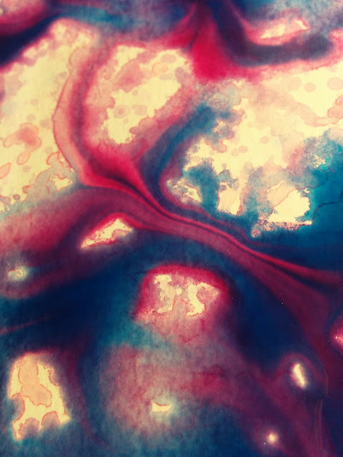
Closeup of colors mixing in the water on the paper.
A larger view of what was happening on the page at the time.
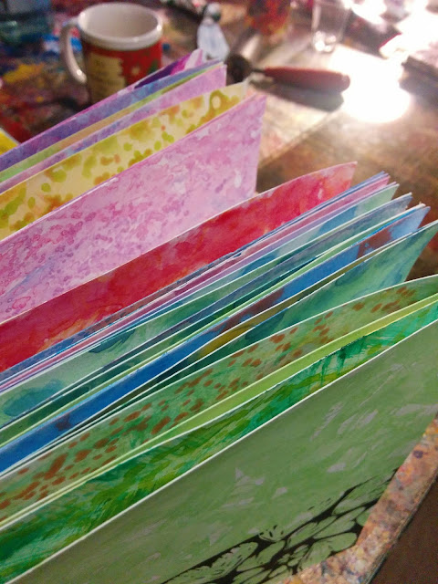
A gradient of pages with the next closest pattern/page next to it.
Lookin' down the barrel of a rainbow!
Sorting these is also a fun project, it reminds me of some Andy Goldsworthy work.
The printing process begins.
I like the results and control using a palette knife to mix colors this year, instead of on the brayer.
The palette knife helps quickly mix and share colors.
My setup for drying the work in the living room with a heated
oscillating fanand document racks laid on their backs.
The dance of balancing colors of ink onto backgrounds, and imaging it
as a middle proces is a fun and challenging game.
So many colors to choose from!
This year, several "twin" prints exist, and I took care to number them sequentially adjacent
to each other where possible, e.g. 001 shares a short-edge with 002, as does 003 to 004.
This was the collection of my favorites this year, and it was hard to pick one for myself again.
Numbering the series xxx/208.
I do all of this by hand, even switching the numbers on the dial.
I'm occasionally surprised at the repetitive monotony
that I enjoy when it's my idea, and I'm realizing my vision.
I used some sticky notes to act as a fence for the prints as I trimmed them, again with a circle cutter.
First in the series, 002/208 and 001/208 on the stack.
Close-up of the prints' edges before final trimming.
Dramatic shot 1 with the block and print.
Dramatic shot 2 with the block and print.
Thank you! May I have another?!
Thank you for being interested in my process!


